
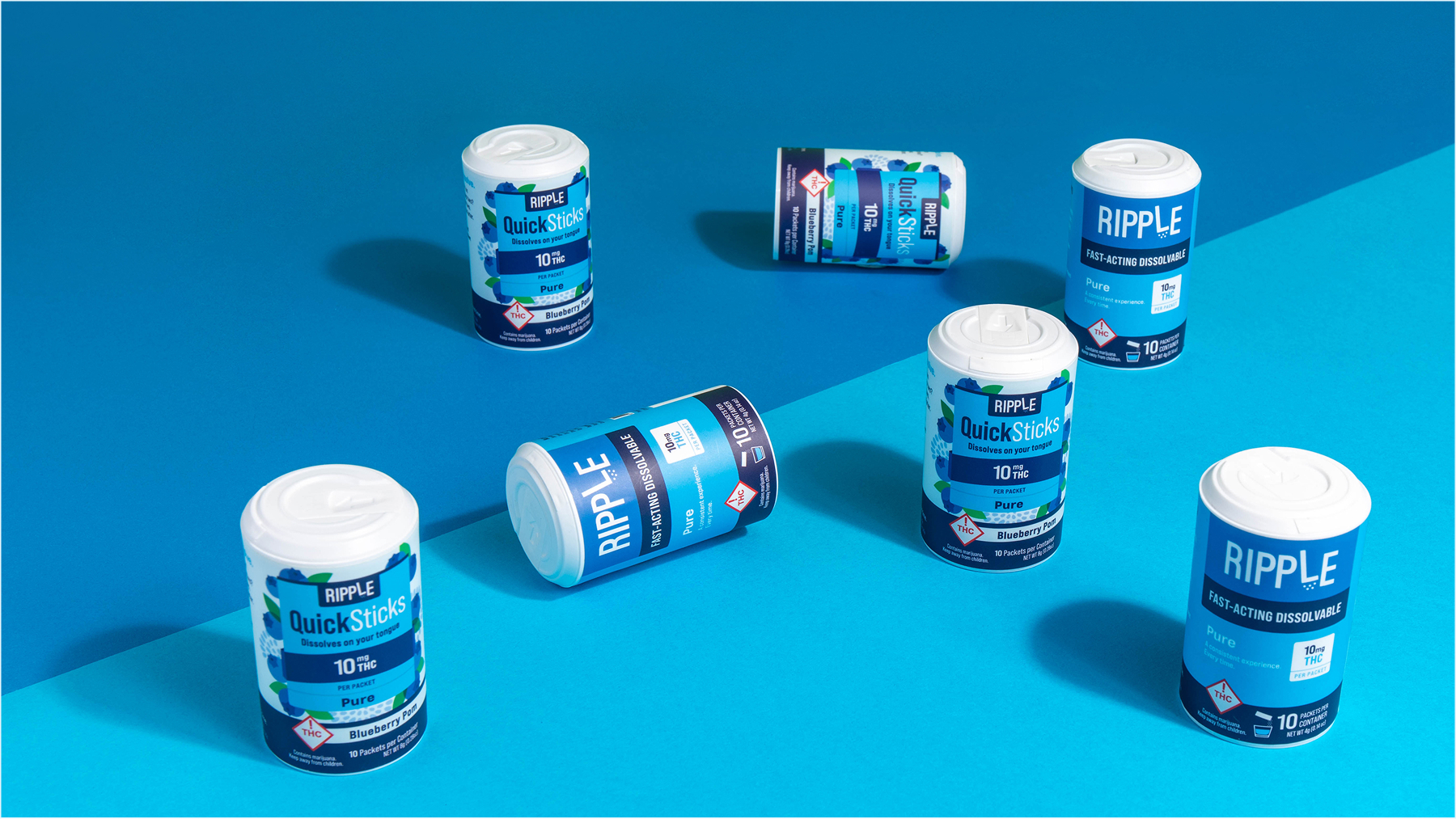
Ripple
Ripple
Ripple
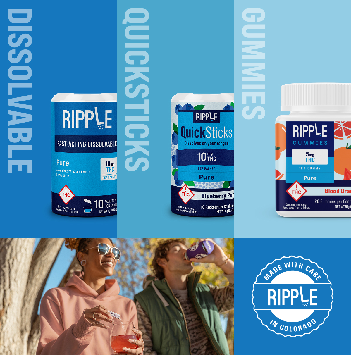
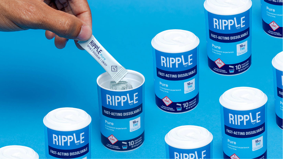
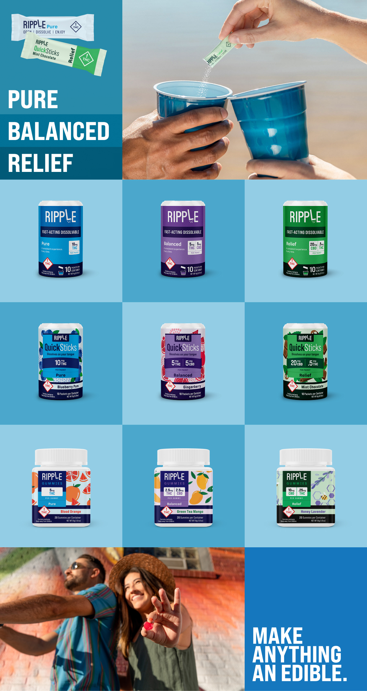
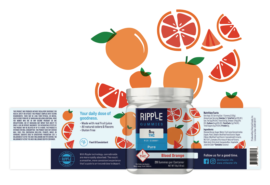
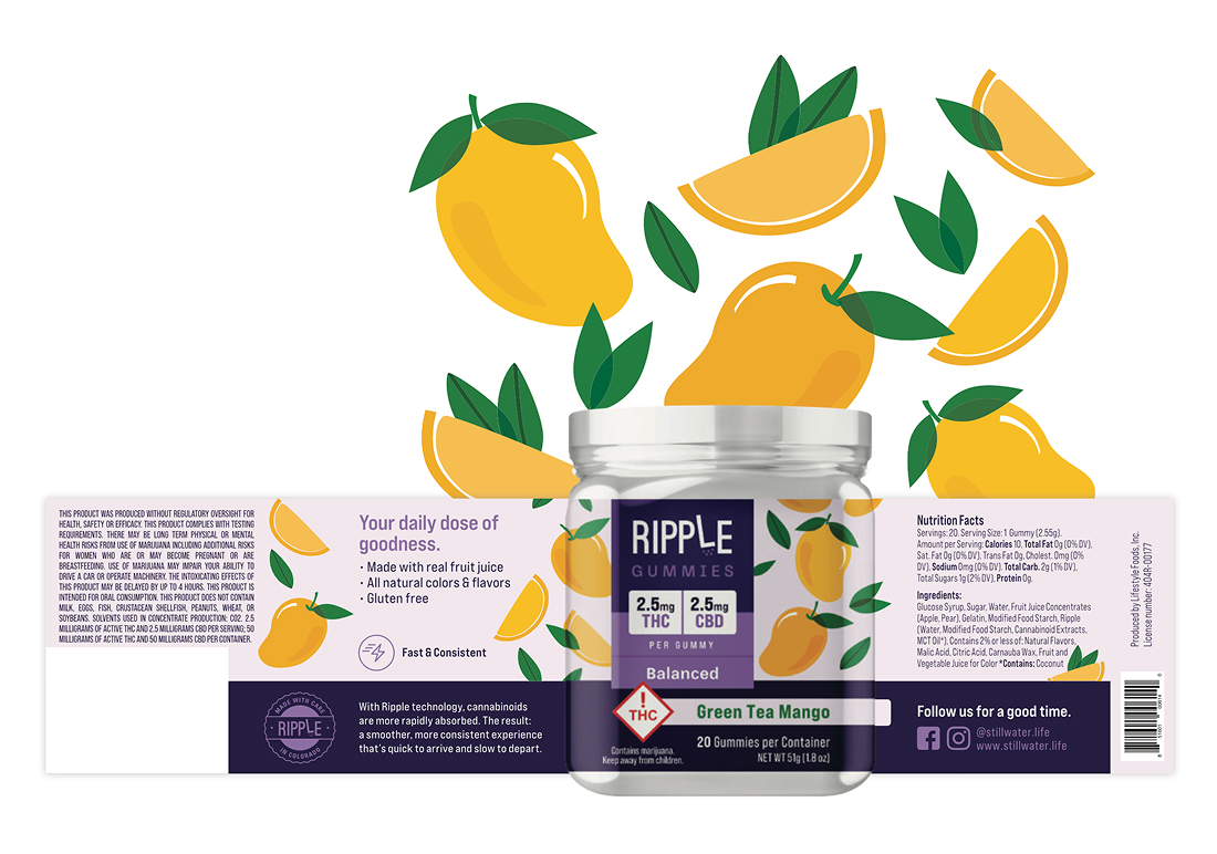
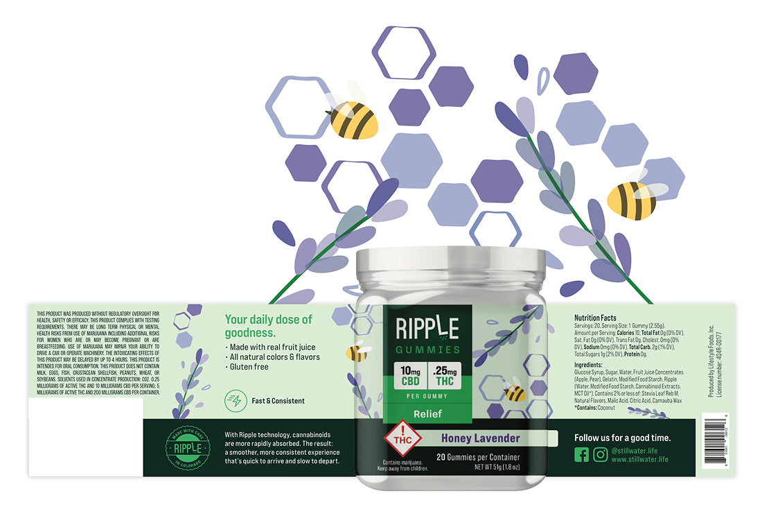
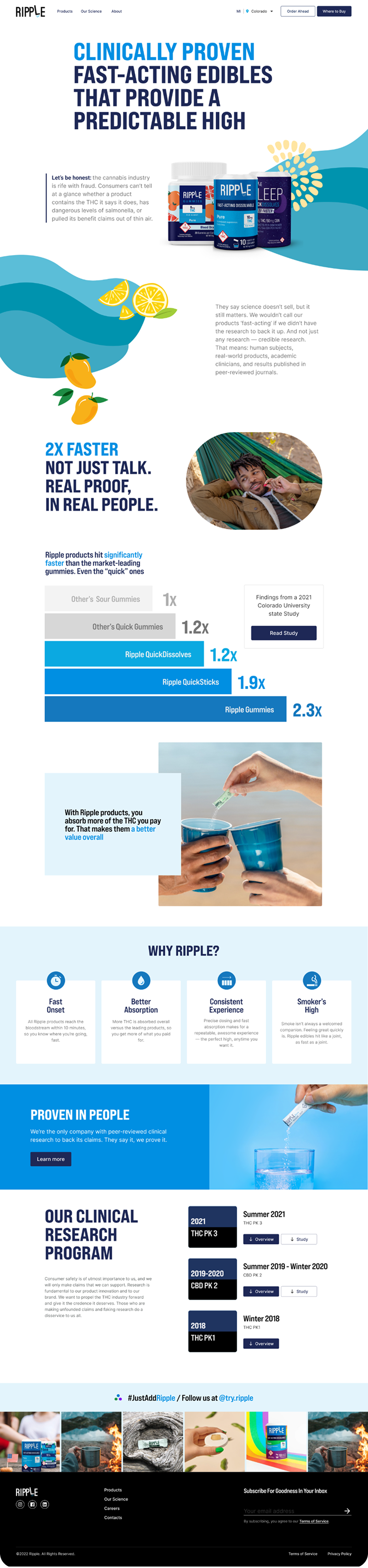
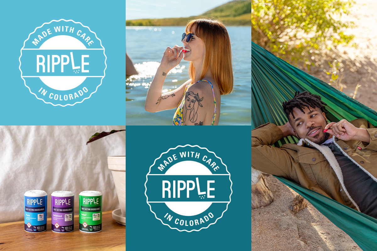
Ripple was already a top seller, but its sister products struggled due to a lack of cohesive branding, making it difficult for consumers to recognize them as part of the same family.
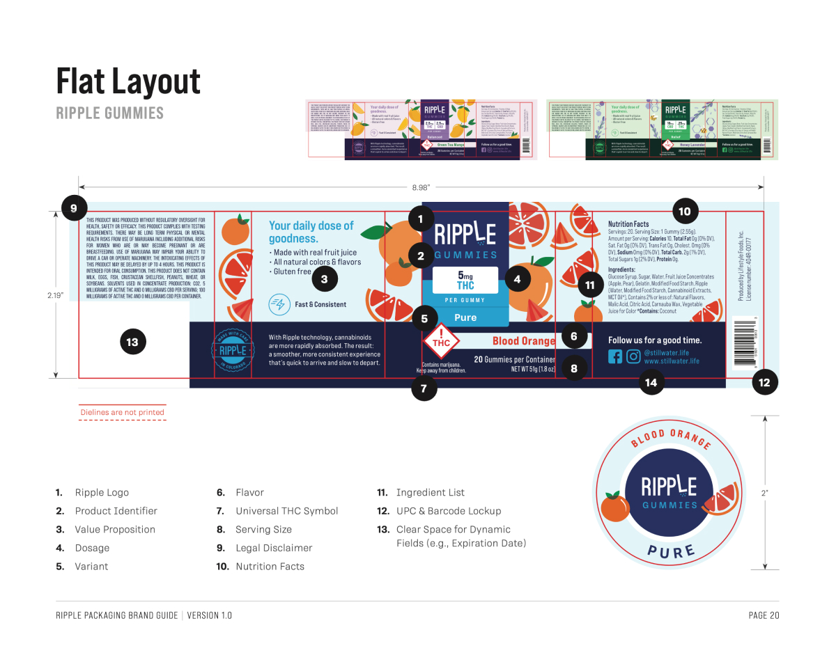
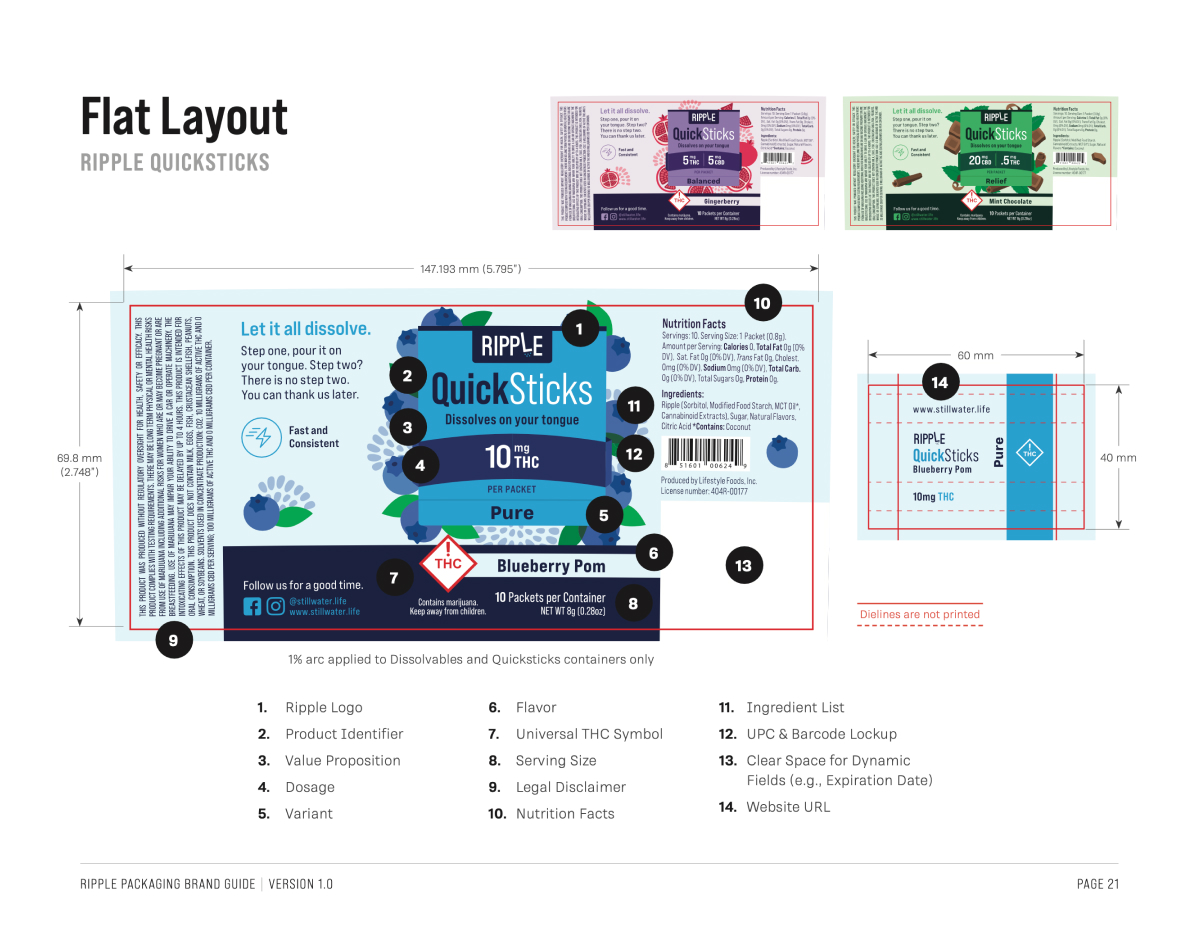
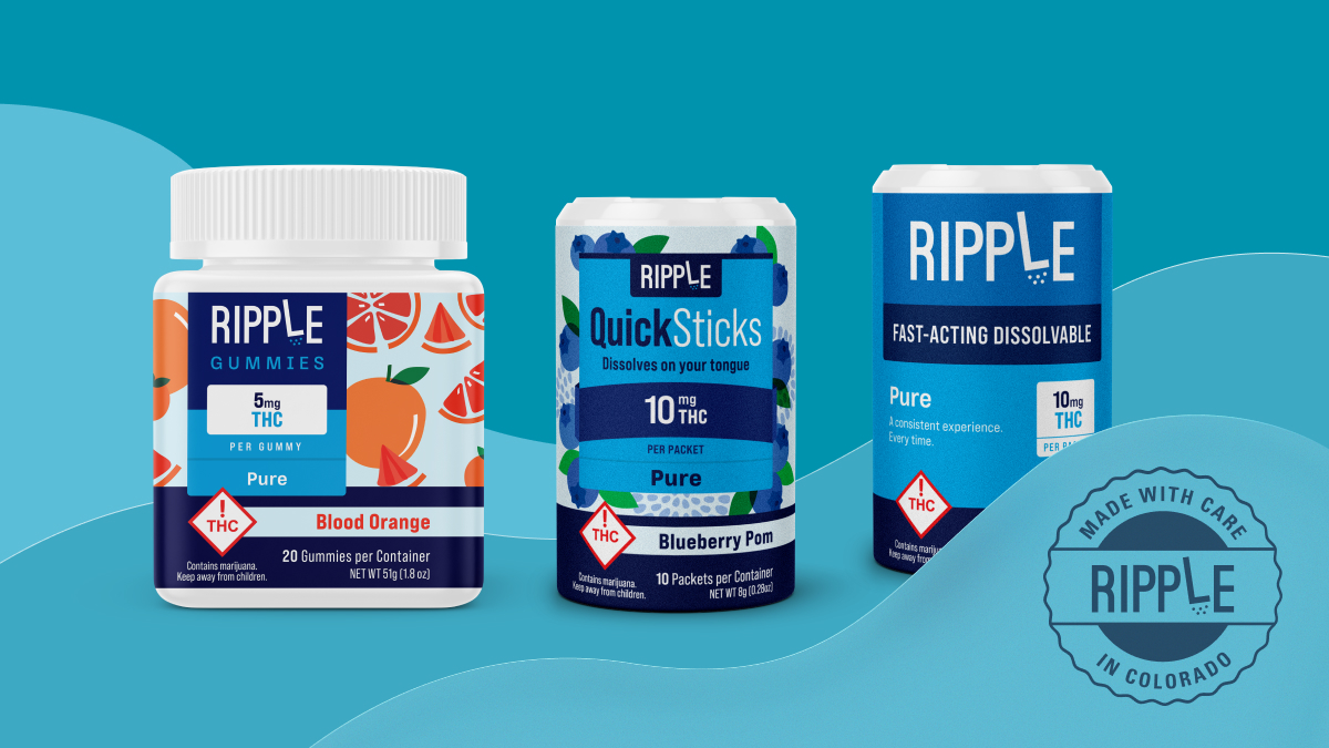
The challenge was to build a unified brand system that tied the entire product family together while helping consumers quickly understand what made each product unique. This meant clearly differentiating THC/CBD dosage levels, consumption formats, and flavors. Each product needed to feel distinct and easy to identify, yet still clearly belong to the same brand ecosystem.
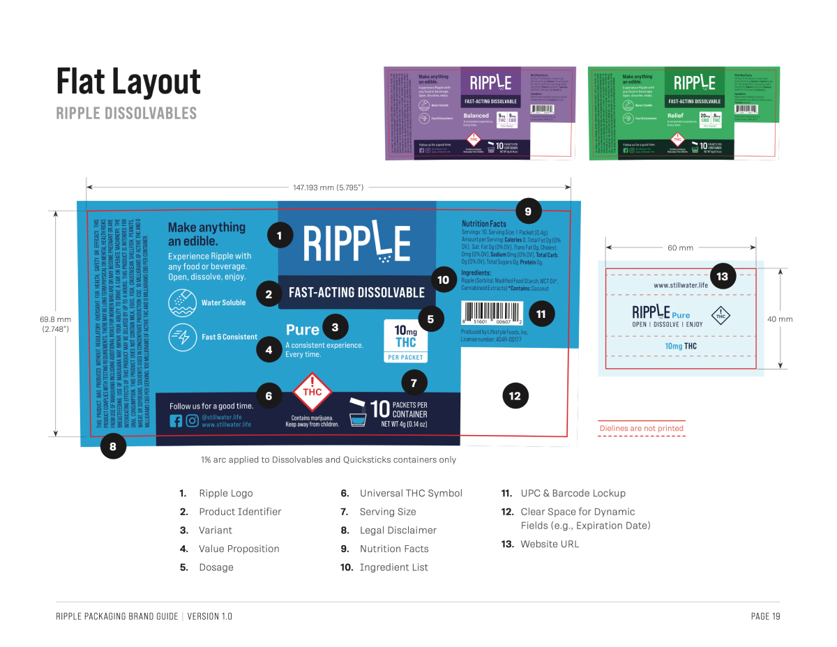
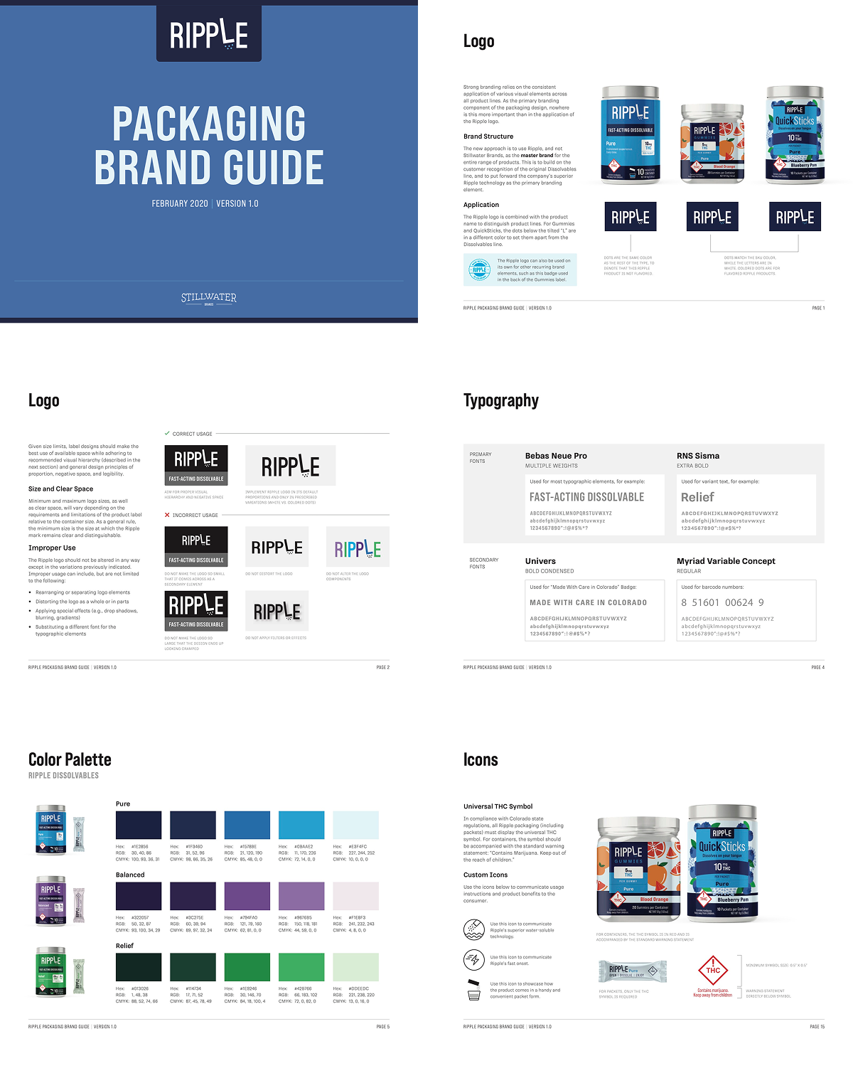
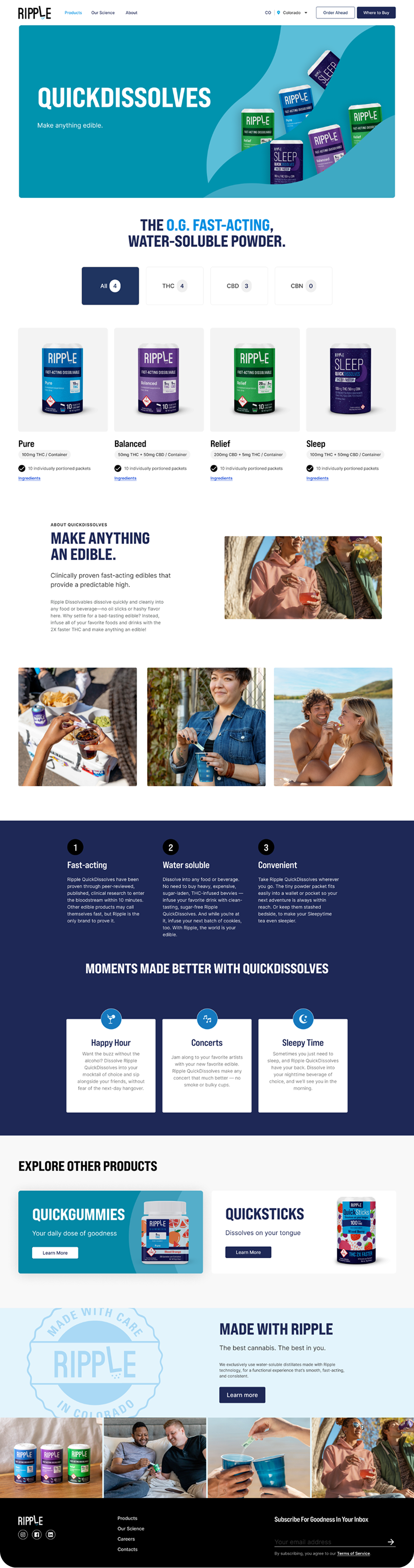
My role was Lead Designer, working closely with the Creative Director to develop and consolidate design concepts, lead the packaging design execution, and prepare final print-ready files. I also collaborated with the Project Manager and a fellow designer on the packaging brand guide and website design.
#Packaging Design #Brand Guide #Website
Ripple was already a top seller, but its sister products struggled due to a lack of cohesive branding, making it difficult for consumers to recognize them as part of the same family.
The challenge was to build a unified brand system that tied the entire product family together while helping consumers quickly understand what made each product unique. This meant clearly differentiating THC/CBD dosage levels, consumption formats, and flavors. Each product needed to feel distinct and easy to identify, yet still clearly belong to the same brand ecosystem.
My role was Lead Designer, working closely with the Creative Director to develop and consolidate design concepts, lead the packaging design execution, and prepare final print-ready files. I also collaborated with the Project Manager and a fellow designer on the packaging brand guide and website design.
#Packaging Design #Brand Guide #Website
Ripple was already a top seller, but its sister products struggled due to a lack of cohesive branding, making it difficult for consumers to recognize them as part of the same family.
The challenge was to build a unified brand system that tied the entire product family together while helping consumers quickly understand what made each product unique. This meant clearly differentiating THC/CBD dosage levels, consumption formats, and flavors. Each product needed to feel distinct and easy to identify, yet still clearly belong to the same brand ecosystem.
My role was Lead Designer, working closely with the Creative Director to develop and consolidate design concepts, lead the packaging design execution, and prepare final print-ready files. I also collaborated with the Project Manager and a fellow designer on the packaging brand guide and website design.
#Packaging Design #Brand Guide #Website
Collaborative Checkout for Social CommerceProduct Design
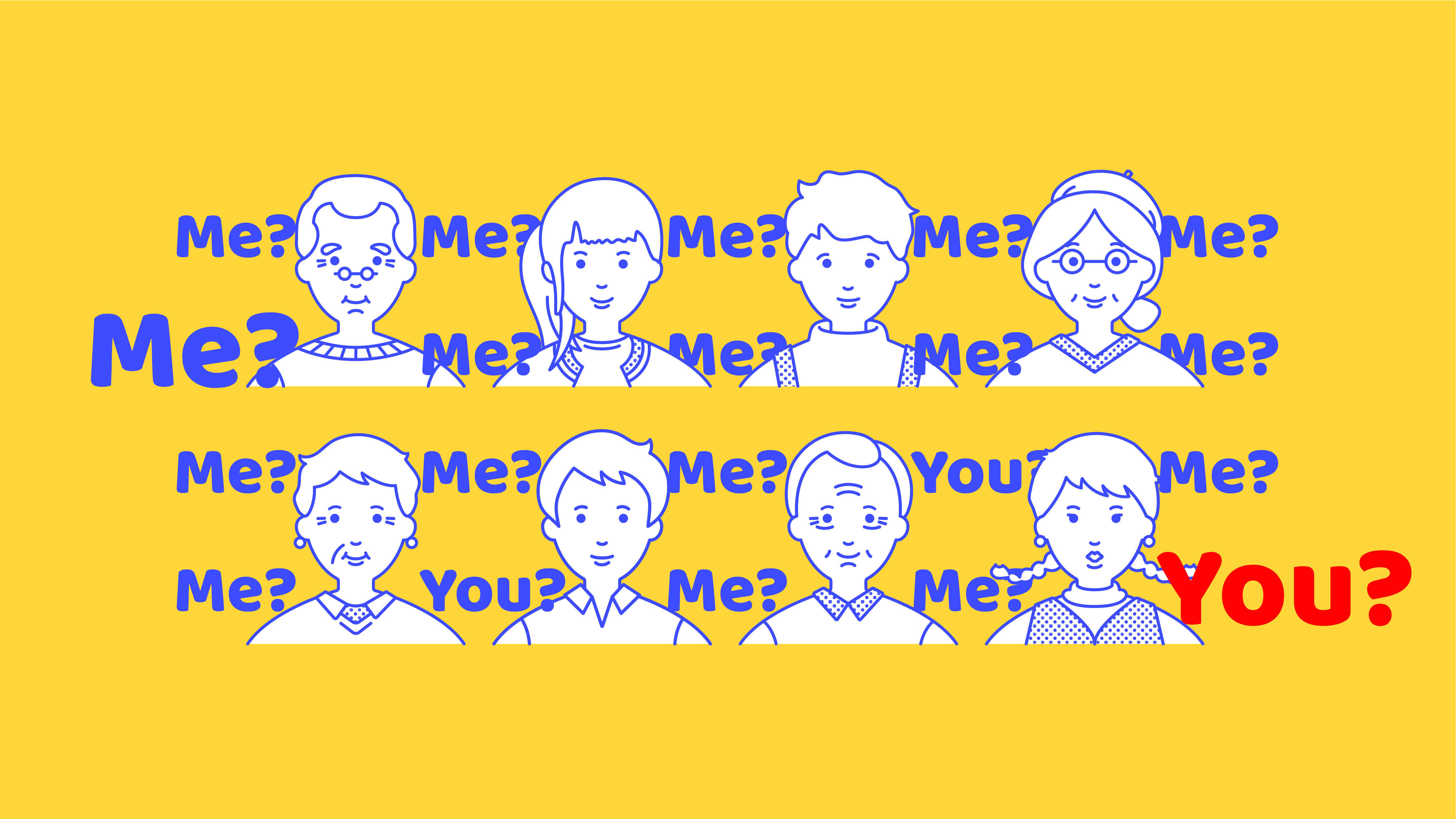
Insta BPMotion Graphics
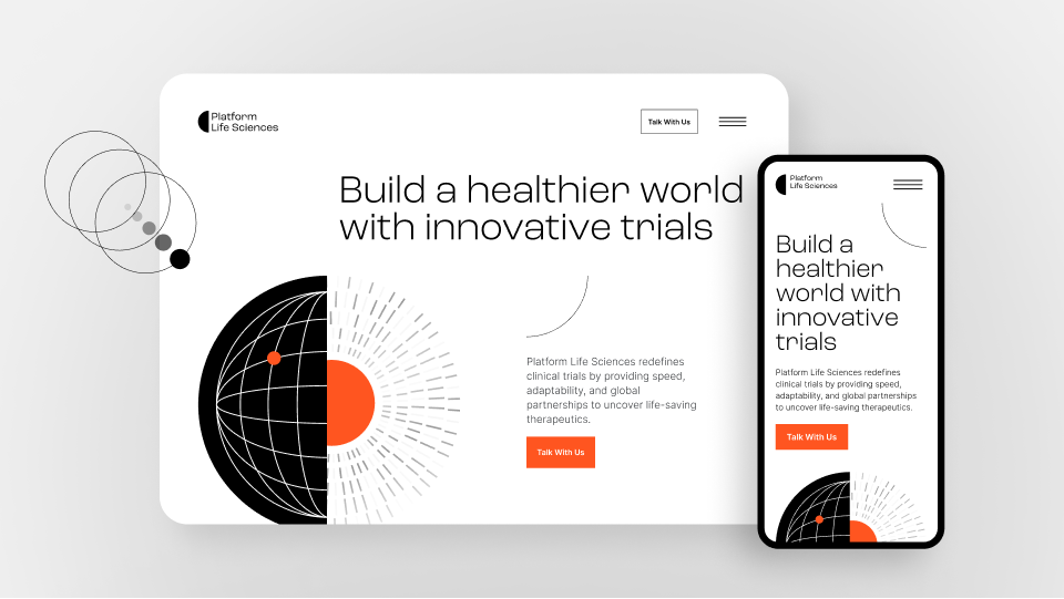
Platform Life SciencesWebsite Design
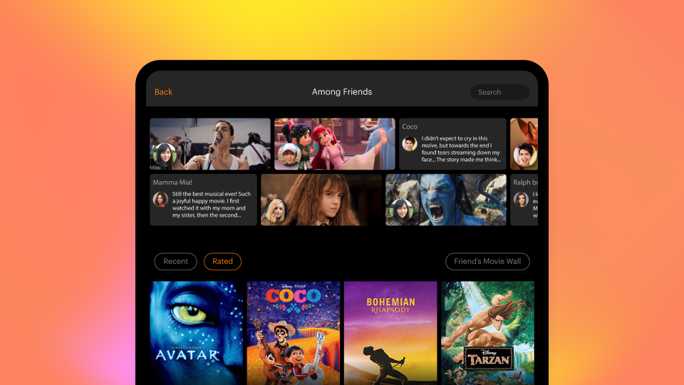
Content Discovery for Prime VideoProduct Design
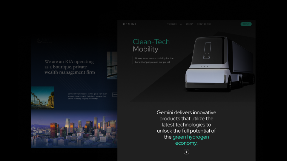
UI Art DirectionWebsite Design
RipplePackaging Design
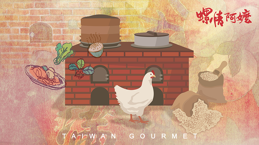
Sailei GourmetBrand Design
YKKBrand Design
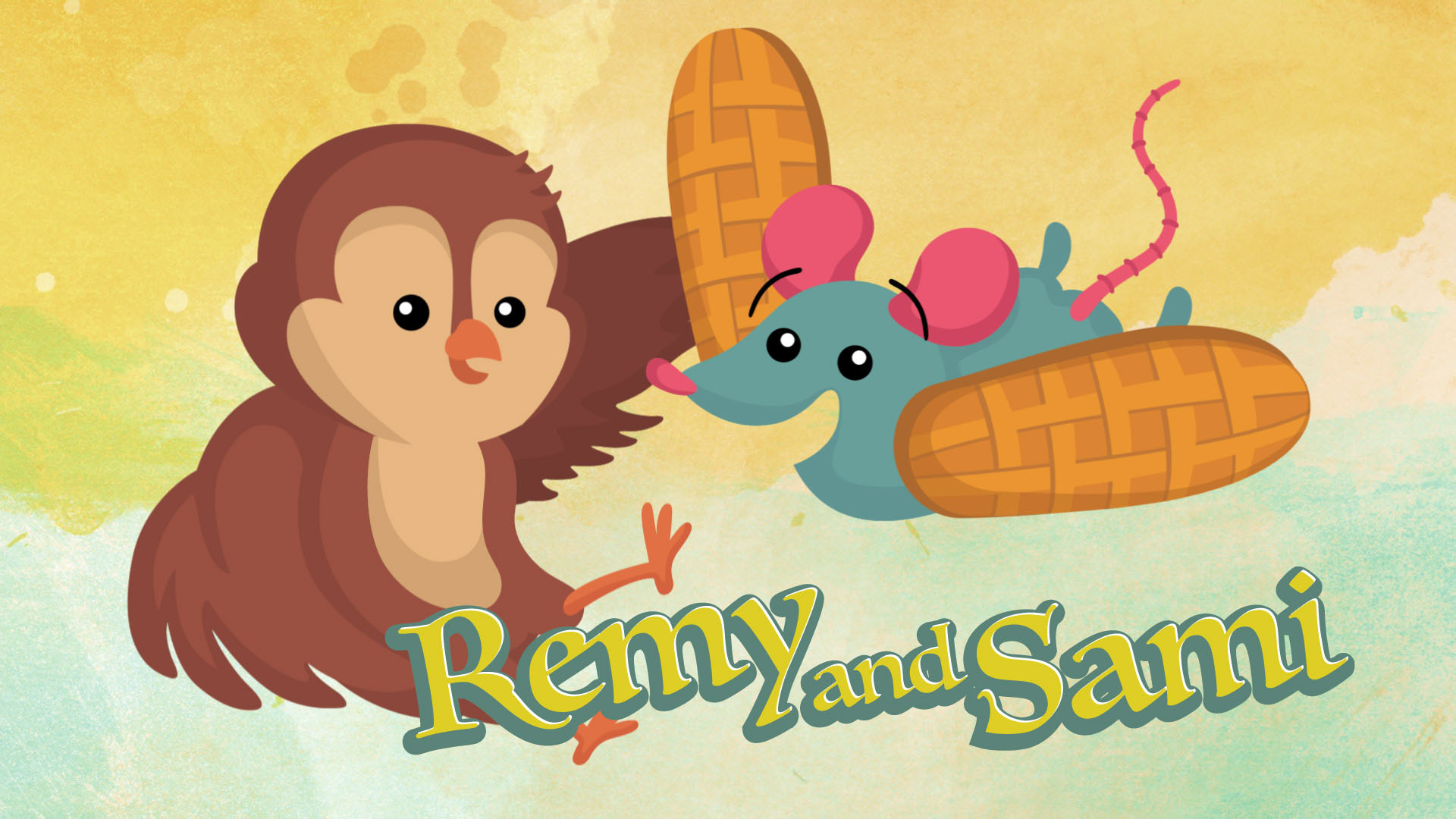
Remy & SamiMotion Graphics
Logo CollectionBrand Design
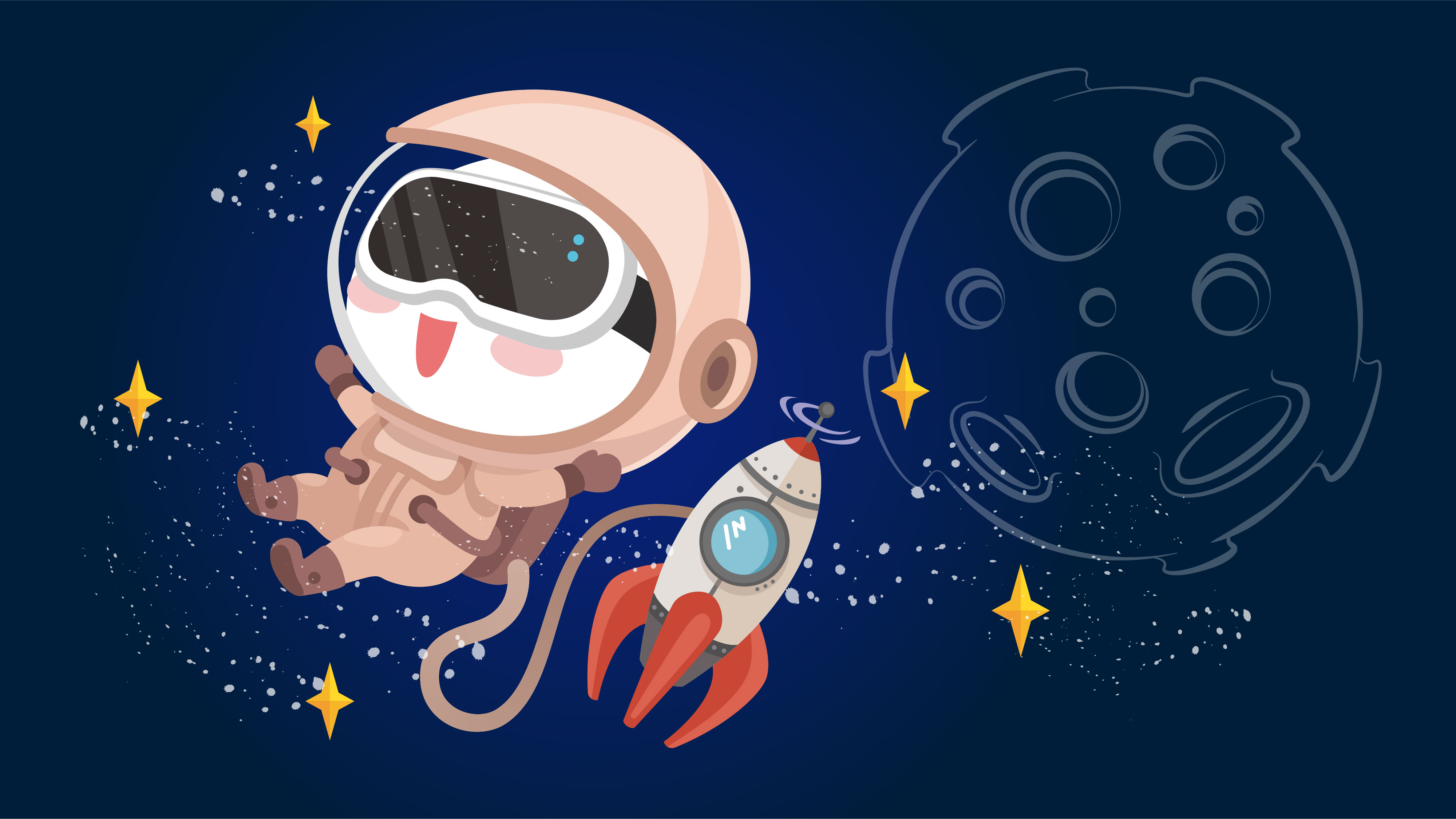
Mascot: VeeCharacter Design
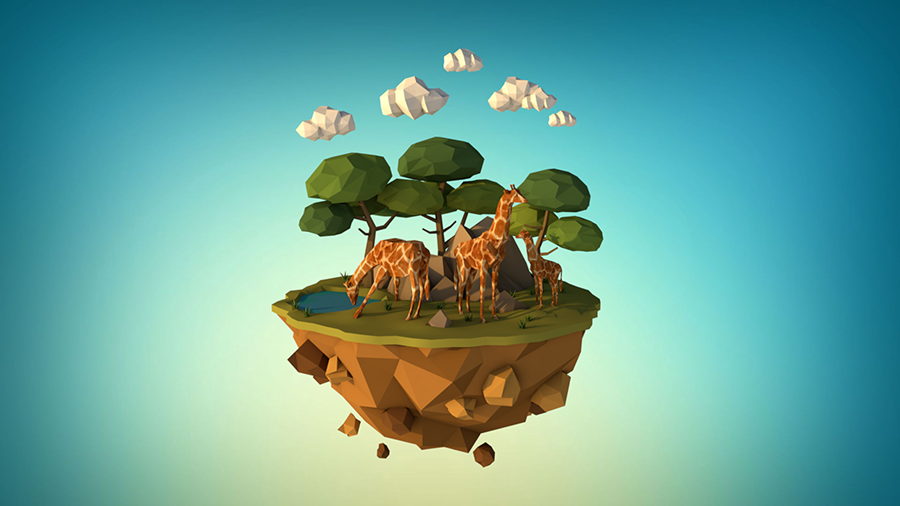
3D Collection3D Modeling
Thanks for visiting. Let's get connected!
Thanks for visiting. Let's get connected!
Thanks for visiting. Let's get connected!
© Phyllis Chen - All Rights Reserved
© Phyllis Design - All Rights Reserved
© Phyllis Design - All Rights Reserved
© Phyllis Design - All Rights Reserved